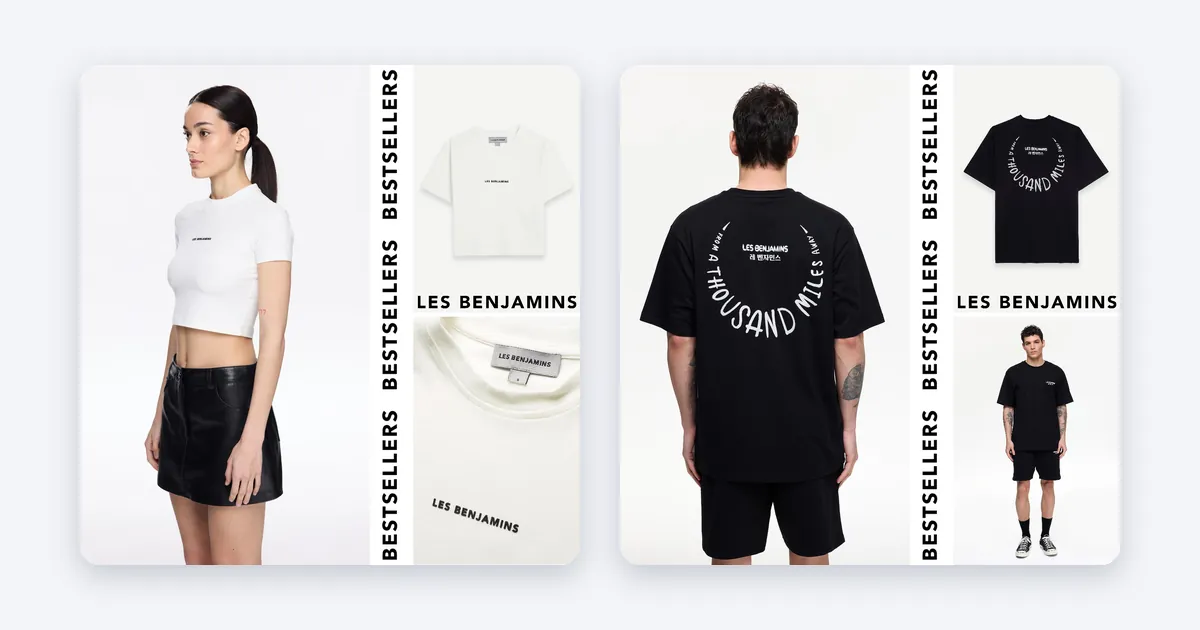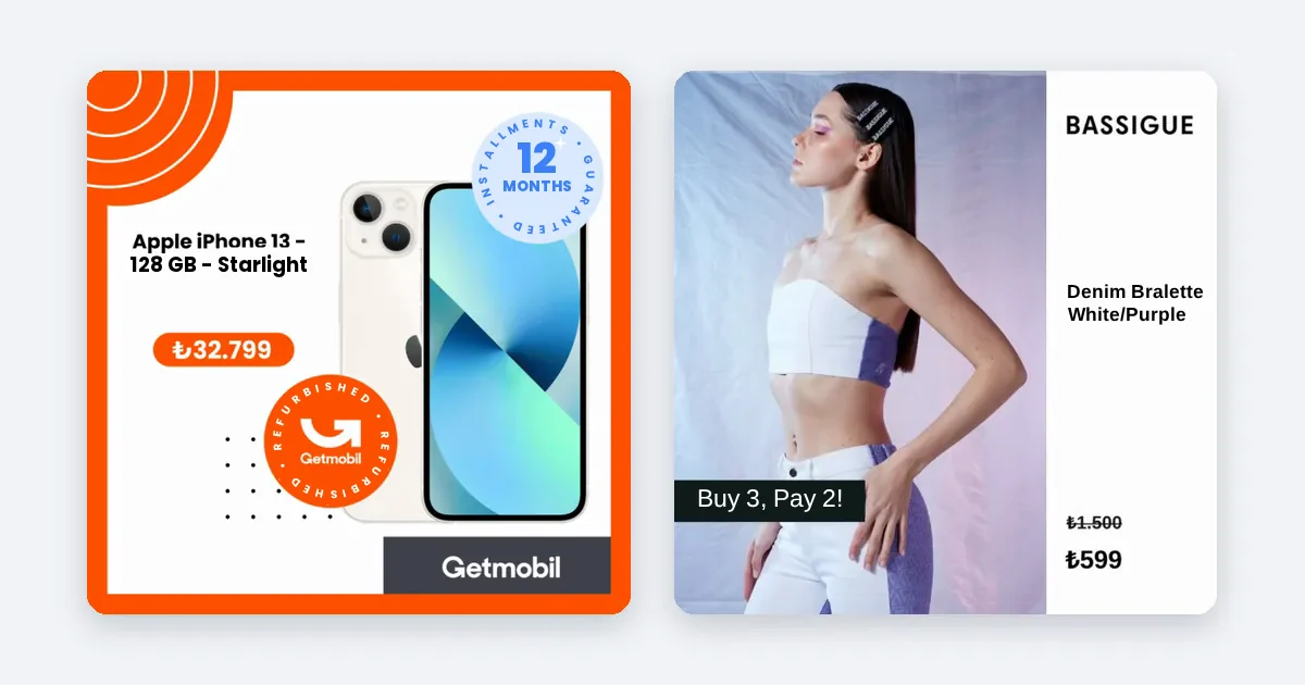
No single color sells best in every e-commerce ad. The colors that work are the ones that make the product stand out from the feed, keep text readable and match your brand, so pick for contrast and consistency first, then test.
Why "the best color" is the wrong question
You will find lists that say red creates urgency, blue builds trust and green feels natural. These are common ideas in marketing, and they are a fair starting point for thinking. They are not rules, and no list can tell you what works for your product, your shoppers and your market. The same red can mean a sale in one place and a warning in another.
So this article gives you a method, not a magic color. We do not quote any figure on color and conversion, because we have none of our own and a number copied from somewhere else would not describe your shop.
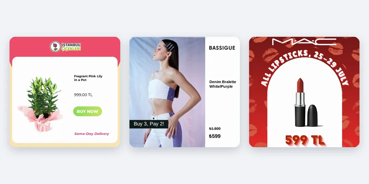
What actually decides whether a color works
- Contrast with the product. If the product is dark, a dark background hides it. The product must be the first thing the eye finds.
- Contrast with the feed. Open Instagram or Facebook and scroll. Your ad has to look different from what surrounds it. A color that blends in is a color that gets scrolled past.
- Readability of text. Price, offer and any words must be readable on a phone. Light text on a light photo fails.
- Fit with the brand. An ad in colors that do not match your site looks like someone else's. The shopper should land on your store and feel they are in the same place.
- Fit with the product and the audience. A children's toy and a luxury watch are not sold with the same palette.
- Consistency across ads. Using the same few colors across all products builds recognition.
Steps to choose colors for your product ads
- Take your brand colors from your site. Write down the main color, one or two supporting colors and the text color. This is your base.
- Look at the products. For each product group, note its dominant color. Choose backgrounds that contrast with it. A neutral or soft background is safe for many products.
- Pick one accent color. Use it only for the price, the offer or the call to action, so it points where you want the eye to go. If every element is an accent, none is.
- Check text contrast. There is a widely used standard for it: the WCAG contrast guidelines ask for a contrast ratio of at least 4.5 to 1 for normal text. It was written for web pages, but it is a good yardstick for text on an ad image too. Free contrast checkers are available online.
- Preview on a phone. Look at the ad small and in bright light if you can. Colors look different there than on your large screen.
- Look at the ad in the feed next to others. Scroll past it. Does it stand out without shouting?
- Test two palettes against each other. Change only the color. Keep the product, text and offer the same, and run both for the same time in Meta Ads Manager. Read click-through rate and purchases.
- Keep what wins and record it. Write down the palette and the result, so you do not repeat the test.
Colors and meaning across markets
Colors carry different meanings in different cultures. If you sell in more than one country, ask someone local. A color that signals luck in one market may signal mourning in another. Do not assume your own associations travel.
Common mistakes
- Too many colors. Three or four are enough. More makes the ad noisy.
- Copying a competitor's palette. It makes you look like them and teaches shoppers to confuse the two of you.
- Ignoring product color. A beige bag on a beige background has no edge.
- Changing palette every week. You lose both recognition and the ability to read a test.
- Choosing by taste alone. Your favorite color is a hypothesis. Test it.
Keeping colors consistent when you have many products
Choosing colors for one ad is easy. Keeping them consistent across hundreds of products and three ratios is the hard part, because each file is made separately and small differences add up. This is a process question: define the palette once, then apply it the same way everywhere.
How Framepx fits
Framepx is an AI system for product ads, offered as AI as a service. Its AI engine turns every product in your feed into your brand's own ad in 1:1, 4:5 and 9:16, with your brand's look carried across all of them. See Pricing for plans.
Frequently asked questions
Is red better than other colors for a sale?
Red is often used for sales because many shoppers associate it with offers, but that is a convention, not a proven rule for your shop. Test it against a calmer accent.
Should I use a white background?
White is clean and safe for many products and shows the product clearly. It also looks like many other ads. Test it against a soft colored background that suits your brand.
How many colors should an ad have?
Usually a base, one supporting color and one accent. Beyond that the eye does not know where to go.
Does color matter more than the image or the offer?
It is one of several parts. A weak offer or a poor photo is not rescued by a good color. Fix the product image and the offer first, then refine color.
Want your brand's look on every product? Schedule a demo.
Written by
Framepx team, Editorial team
The Framepx editorial team writes for brands, marketers and agencies about ad platforms, measurement, creative and product feeds.