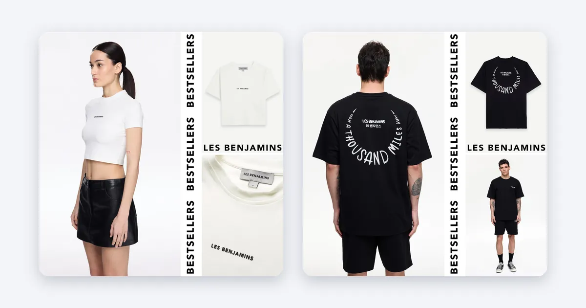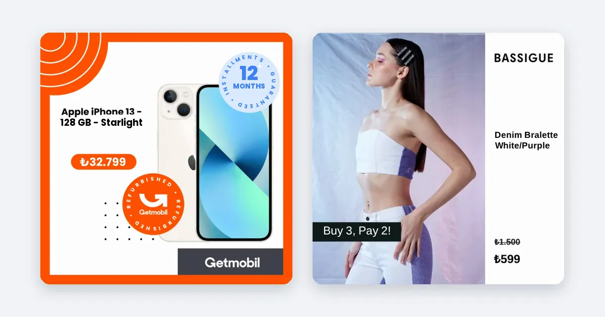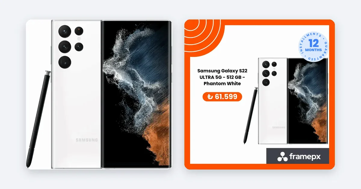
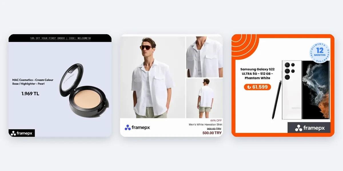
Put the logo small and clear in one fixed corner of the image, away from the product and away from the edges that the app covers. Use the same spot on every ad, so shoppers learn to recognize you before they read a word.
What the logo is for in a product ad
In a product ad the product is the hero. The logo has a smaller job: tell the shopper whose product this is. On Meta the account name and profile picture already appear above or on top of the ad, so the logo in the image is a second, quieter reminder. If it is too large, it competes with the product. If it is missing, ads from different products stop looking like one brand.
The rules that hold in almost every case
- Keep it small. A small logo is usually enough. The product should be the first thing the eye lands on.
- Choose one corner and keep it. Top left, top right, bottom left or bottom right: the exact corner matters less than using the same one every time.
- Leave a margin. Do not push the logo against the edge. A clear margin stops it being cut off when the placement crops the image slightly.
- Keep it away from the product. A logo that overlaps the product hides detail and looks careless.
- Check contrast. A dark logo on a dark background disappears. Keep a light and a dark version of the logo and use the one that reads.
- Use the simple version. If your logo has a long tagline under it, use only the mark or the name at small sizes.
- Do not stretch it. Keep the original proportions.
Where each ratio needs care
Meta documents a safe zone for Stories and Reels: the areas at the top and bottom of a full screen vertical ad where the interface sits on top of the image. Read About text overlays and the safe zone for ads in Stories and Reels before you fix a position. For ratios, see Best practices for aspect ratios. Both are in Meta's Business Help Center, and Meta may update them.
- 1:1 (square). The most forgiving ratio. A corner with a clear margin works. Check it in the preview, because the Feed may show it slightly differently from a carousel.
- 4:5 (portrait). More space top to bottom. The same corner as the square works, with the margin kept proportional.
- 9:16 (full screen vertical). Do not put the logo in the top or bottom strips. Move it inward, into the safe area, even though that means a different position from the other ratios. A logo hidden under the account name or the caption button helps nobody.
If the logo has to sit in a different place in 9:16, keep it in the same corner side, so the ad family still feels consistent.
Steps to place the logo on a product ad
- Export the logo cleanly. Use a transparent PNG or a vector file, at a large size, so it stays sharp when scaled down.
- Pick the corner and the margin. Write them down as a rule: for example "top left, margin of a few percent of the image width". Decide your own numbers and keep them.
- Apply the rule to the 1:1 version first. Look at it beside the product.
- Apply it to 4:5. Check the margin still looks the same.
- Move it inward for 9:16. Check against Meta's safe zone page.
- Test on a phone-sized preview. In Meta Ads Manager, preview every placement. Is the logo readable but not loud?
- Check three different products. A logo that works on a white shoe may vanish on a dark jacket.
- Keep one fallback. For products with busy backgrounds, use the logo version with a plain backing shape.
Mistakes to avoid
- A huge centered logo over the product. It turns the ad into a banner and hides what you sell.
- A different corner on every ad. The brand feels scattered.
- A thin light logo on a bright photo. It cannot be read.
- Text and logo stacked in one corner. Give each its own space.
- Forgetting the margin. The first crop cuts it.
When logo placement becomes a production problem
For ten products you can place the logo by hand. For hundreds of products, with three ratios each, a position that is slightly different in each file is the usual result, and nobody notices until the ads run next to each other in a feed. The fix is a rule applied by the system, not by a person at each file.
How Framepx fits
Framepx is an AI system for product ads, offered as AI as a service. Its AI engine turns every product in your feed into your brand's own ad in 1:1, 4:5 and 9:16, so one brand look is applied across all three. See Pricing for plans.
Frequently asked questions
Does every product ad need a logo?
No. Some brands rely on the account name and a strong, consistent look. If your products are not well known, a small logo helps shoppers connect the ads with your brand.
Should the logo be on the product photo or on a banner strip?
Either works. A plain strip gives the logo a stable background and a clear margin, but takes space from the product. Test both on a few products.
How big should the logo be in a 9:16 ad?
Small, and inside the safe area. Meta's safe zone page shows which areas the interface covers. Preview the ad on a phone-sized view before you publish.
Can I use a different logo version on different ads?
Yes, if the versions are clearly the same brand. A light version for dark photos and a dark version for light ones is normal.
Ready to see your own products as ads? Schedule a demo.
Written by
Framepx team, Editorial team
The Framepx editorial team writes for brands, marketers and agencies about ad platforms, measurement, creative and product feeds.